change of artist...
- jack1974
- Pack leader
- Posts: 15481
- Joined: Thu Jun 16, 2005 4:43 pm
Re: change of artist...
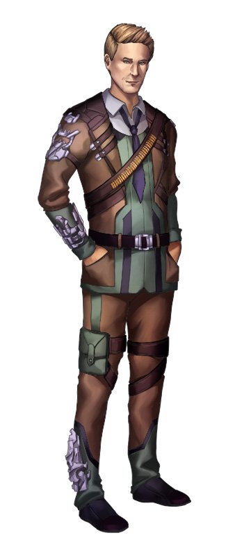
and this is Arthur, the male one. I'm not an expert of "hot males", though I think the result is good too
- OhHaiMe
- Young scout
- Posts: 45
- Joined: Tue Feb 03, 2015 6:14 pm
Re: change of artist...
Hmmm..I..Hmmm.
I don't like it but I don't hate it either, it's just kind of bland and generic. Arthur's face is too small but other then that there's not really anything I can say specifically looks wrong with it other then that it just doesn't quite capture any interest from me.To me it's forgettable and doesn't grab attention, which could be worse then being actively bad for marketing purpose.
I just looked over the images again and I think part of the reason I don't like it is the odd shadow/highlights. They seem to have a strange gradient, amorphous and uniform look across all the different textures. The skin,leather and fabric all seems to have the same shine. it makes it all just run together to the eye and look like a big blob. It make it look very amateurish. Like the artist just a applied the same filter or gradient brush across the whole image.
I think it need more hard edges,especially if you want to accentuate the more constructed look of Victorian/Victorian inspired steampunk fashion.
It's possible I may be being too harsh just because it share's this look of excessive softness with the art of PSCD but thankfully it does not have PSCD's lack of depth and uncanny faces.
- jack1974
- Pack leader
- Posts: 15481
- Joined: Thu Jun 16, 2005 4:43 pm
Re: change of artist...
Haha yes, at least the uncanny faces is not there. Also, are you talking only about Arthur, right? because if people say that this Ann looks "weird" too, I'm going to cancel the game! (I'm joking of course ).
Thank god this is the first and last game in which "the characters must look older"*.
* by older means 30+ years old, as opposed to the usual band of teenagers seen in all manga games
Thank god this is the first and last game in which "the characters must look older"*.
* by older means 30+ years old, as opposed to the usual band of teenagers seen in all manga games
- jack1974
- Pack leader
- Posts: 15481
- Joined: Thu Jun 16, 2005 4:43 pm
Re: change of artist...
Those are Anja and Abhay, twins. I think they both look awesome, but at this point I'm wondering about my own tastes
- OhHaiMe
- Young scout
- Posts: 45
- Joined: Tue Feb 03, 2015 6:14 pm
Re: change of artist...
Only Arthur has the too small face but both Ann and Arthur look overly soft,shiny and unfocused to me. The Twins do look a better then Ann and Arthur I think. Probably because the darker colors tone down the odd highlights.
- jack1974
- Pack leader
- Posts: 15481
- Joined: Thu Jun 16, 2005 4:43 pm
Re: change of artist...
I see, thanks. Well I might still ask a few tweaks if needed. Was talking with another artist and she pointed out the eyes are a bit smaller (except Ann), so might be worth trying making them a little bigger.
Anyway at least there's not anymore the "scary" reaction of previous art. It's already a good thing
-
- Woods ranger
- Posts: 135
- Joined: Sun Feb 06, 2011 11:20 pm
Re: change of artist...
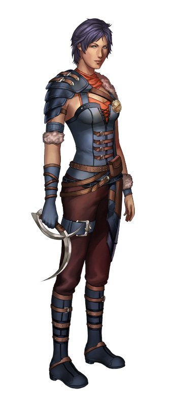
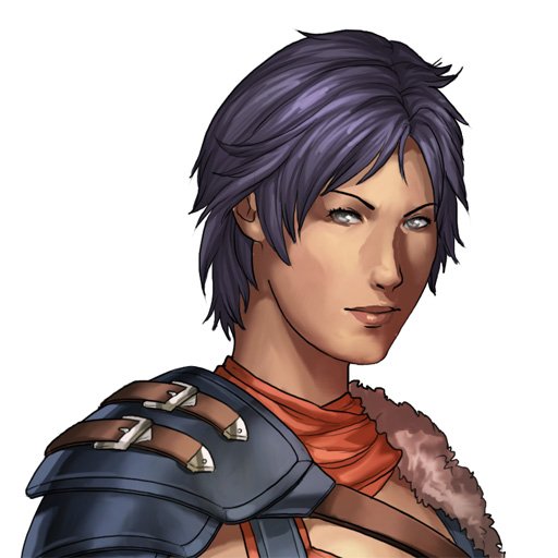
Ann's design is pretty gorgeous! However, for the other 3, theirs eyes are a little small. Too tucked in, if you will. It'd be good to have them a little larger, as your artist suggested.jack1974 wrote:I see, thanks. Well I might still ask a few tweaks if needed. Was talking with another artist and she pointed out the eyes are a bit smaller (except Ann), so might be worth trying making them a little bigger.
Anyway at least there's not anymore the "scary" reaction of previous art. It's already a good thing
- jack1974
- Pack leader
- Posts: 15481
- Joined: Thu Jun 16, 2005 4:43 pm
Re: change of artist...
OK will ask artist to make a test with bigger eyes and see how they look
- BobTheMob
- Druid
- Posts: 464
- Joined: Sat Mar 12, 2016 10:37 pm
Re: change of artist...
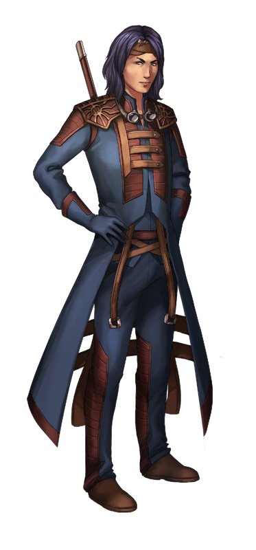
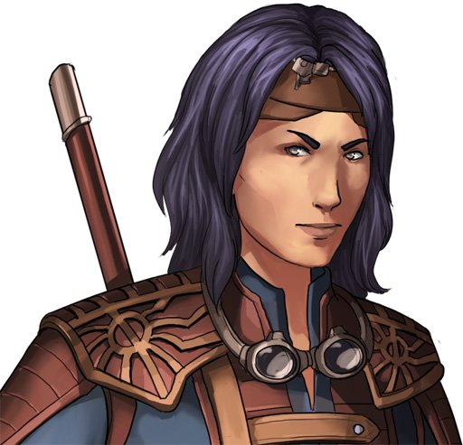
Which is Anja and which is Abhay?jack1974 wrote:Those are Anja and Abhay, twins. I think they both look awesome, but at this point I'm wondering about my own tastes
I ask since those both sound like potentially female names to me and the upper pics seem like they're of a dude.
They both look awesome, btw. The girl reminds me of a character from Final Fantasy X or X-2.
- jack1974
- Pack leader
- Posts: 15481
- Joined: Thu Jun 16, 2005 4:43 pm
Re: change of artist...
Yes upper pics is Abhay. They're supposed to look almost identical except for a few features