jack1974
Jun 11, 2018

https://pbs.twimg.com/media/Dfan0YLW4AEnQWq.jpg" style="max-width:100%">
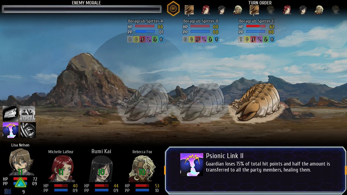
fixed alignment of the defensive skills and also added a reload sound to each weapon. I like this system since even if are randomly generated each weapon has a specific sound and reload sound, it's nicer than just using global randomized sounds as it was in the beginning

Jaeger
Jun 11, 2018
 https://pbs.twimg.com/media/DfVCbbyXcAAk9mf.jpg" style="max-width:100%">
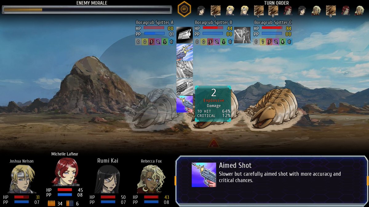
the targeting / dmg preview GUI now looks more sci-fi. I have added some animations but I've been careful to not delay the resposivity (I made some tests and even if I could add some nice fading effects players will want to see the damage info immediately).
The font is an improvement. However, to make it look more like an targeingt reticle, the green background could be removed.
jack1974
Jun 12, 2018
If I remove the green background the text is unreadable. Believe me I made TONS of tests

I had a much sci-fi looking version but you couldn't read the texts so I had to change it, since that's the most important thing.
jack1974
Jun 12, 2018
[youtubeWD]dr7youigc-Q[/youtubeWD]
made a video showing a bit how the combat works and the difference that makes equipping the "right" weapon. The level will be the most important thing, but also the damage type will have impact of course.
I used a text to speech software to do the voice so you won't have to listen to my ugly voice and terrible English
Jaeger
Jun 12, 2018
If I remove the green background the text is unreadable. Believe me I made TONS of tests I had a much sci-fi looking version but you couldn't read the texts so I had to change it, since that's the most important thing.
The damage preview should be readable without the green background, and wouldn't really be much different from the battle UI in Cursed Lands, which seems to use a similar text. For the rest of the text, which uses a smaller font size, I could see your point. Using abbreviations and all capital letters (ex: CRIT, DMG, etc) could be used to make room for larger text size though. In the latest video, the giant boragrub uses "melee attack" with a even smaller font size and no text box to aid in readability.
jack1974
Jun 12, 2018

https://i.imgur.com/qLn2JWY.jpg" style="max-width:100%">

https://i.imgur.com/CMoV2dc.jpg" style="max-width:100%">
here are tests I did using the same GUI but with a more transparent background. I personally think it's bad (my eyes hurt trying to read it, even the bigger texts

). Remember that players don't see so zoomed in.
As for "melee attack" those are the skill names displayed so a different thing from targeting, I think that might work (maybe I will display a gradient to black overlay).
jack1974
Jun 13, 2018
The thing is that the images I posted are readable to me too

but if you play the game windowed, it's impossible to read them (because the text is much smaller). Playing in fullscreen is fine instead. But I can't design something that is hard to play while windowed. Anyway this is a minor problem, it can be changed easily
As for the skills I checked and indeed it's different, uses a thicker black outline than the normal texts, so making it more readable. I will make the text bigger though in any case. All those things can be tweaked during testing of course.
Troyen
Jun 13, 2018
To be fair, the colored Explosive text is a little hard for me to read on your original screenshot too, which I assume wasn't zoomed in. Maybe the text color needs to be a few shades brighter?
Of course, this is all on borugrubs, a brighter-colored enemy might make the rest of it hard to read.
jack1974
Jun 13, 2018
Of course, this is all on borugrubs, a brighter-colored enemy might make the rest of it hard to read.
Yes lol that was the point: with a transparent background (or semi transparent) depends a lot on what kind of art there's behind it. A white/light text might be hard to read over a white/light enemy and so on. That's why I used that GUI image even if looks less "cool"
jack1974
Jun 16, 2018
https://pbs.twimg.com/media/Dfy5hWbWsAADBJF.jpg" style="max-width:100%">
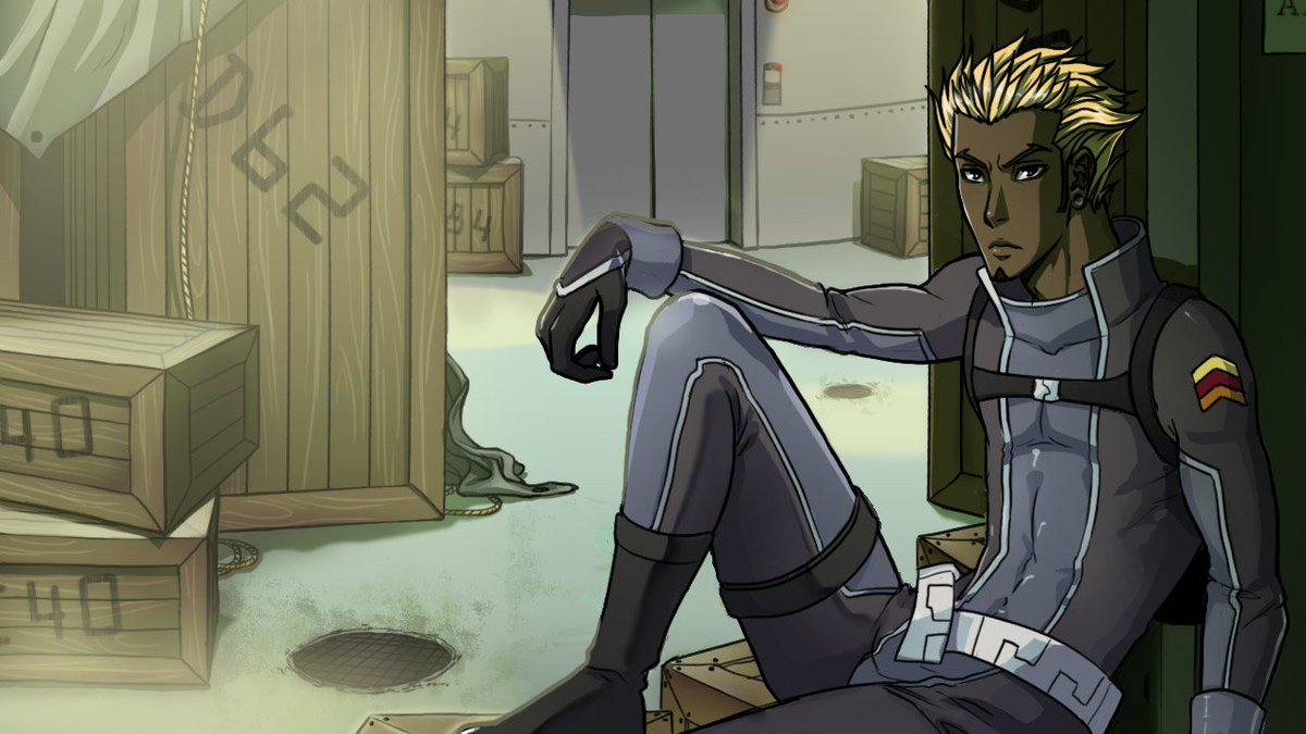
one of the new camp talk images, the original had Damien in his usual rebel outfit. Now he is a proper soldier

I think this artist did a great job editing the existing images.
jack1974
Jun 17, 2018
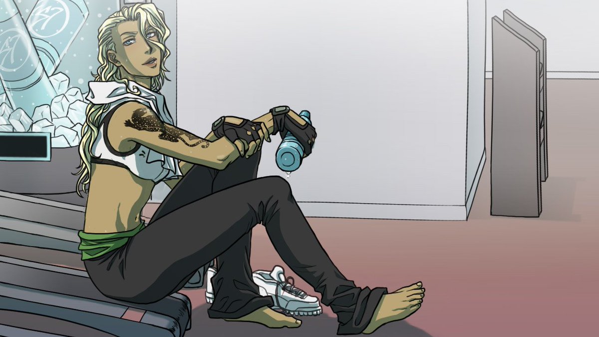
This game is full of hot people!! Check Rebecca
https://pbs.twimg.com/media/Df5hgeAWsAAO7Qw.jpg" style="max-width:100%">
jack1974
Jun 20, 2018

https://pbs.twimg.com/media/DgHXBo0W0AATpUo.jpg" style="max-width:100%">
And here's Milo in his perfectly cleaned and in order room
For each image there's also an... alternate version with "interesting" outfits or poses which I'll post in the next weeks on Patreon and will present in the final game
jack1974
Jun 21, 2018
https://pbs.twimg.com/media/DgMdh56WAAErfQU.jpg" style="max-width:100%">
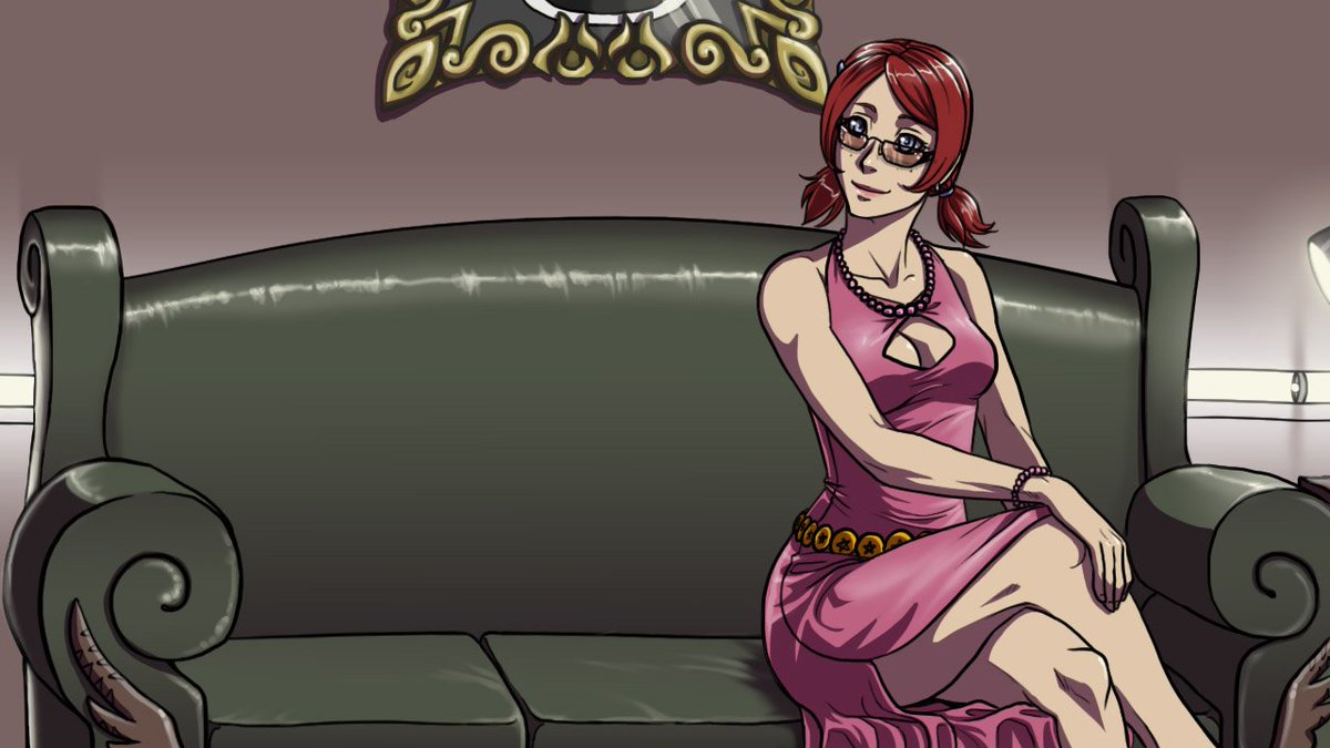
Michelle in her elegant outfit, on a couch in the colony lounge. Despite her laid back attitude, I am writing some really... tough scenes with her and about her past
Troyen
Jun 21, 2018
Something seems a little...off about her face there. Maybe it's the angle or the glasses, but it looks more...narrow than usual?
jack1974
Jun 21, 2018
Not sure, could be the glasses indeed. In any case all the faces were done by the original artist, only some alternate poses will be done by the new one.
jack1974
Jun 22, 2018
https://pbs.twimg.com/media/DgScuTGW0AIJKUR.jpg" style="max-width:100%">
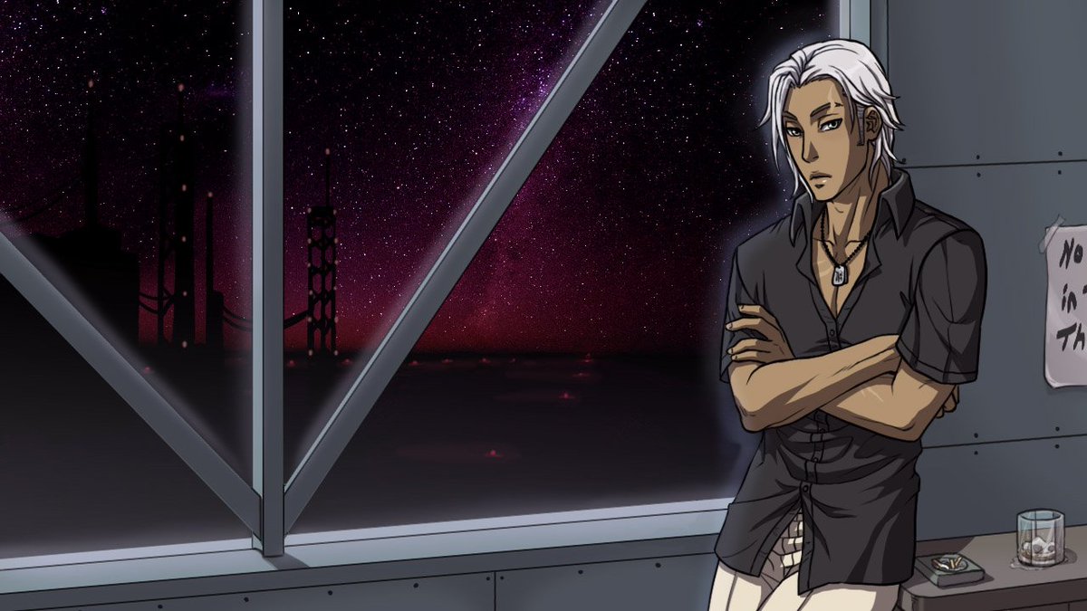
Here's Tom in his camp talk pose: I think you're right and the artist started to draw the faces a bit more thin? he looks different as well. Or maybe it's how she draws the faces/heads front vs side (even in the first PS1 they looked quite different).
jack1974
Jun 23, 2018
https://pbs.twimg.com/media/DgXPkzHXcAAaQ7k.jpg" style="max-width:100%">
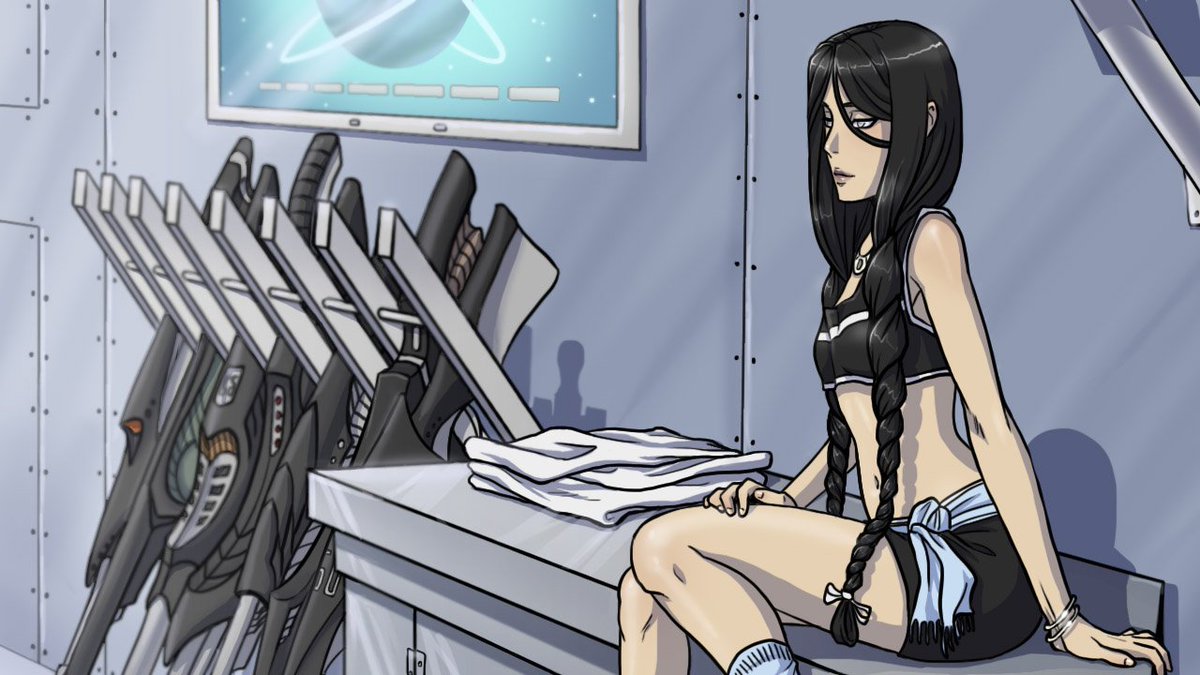
Rumi camp talk scene, it was one of the first to be done. I don't like much the fact that she's looking on the side, even if she's blind so in theory doesn't need to look at you in the eyes, but... I don't know still feel weird. But sadly can't change it now
