jack1974
Aug 01, 2017
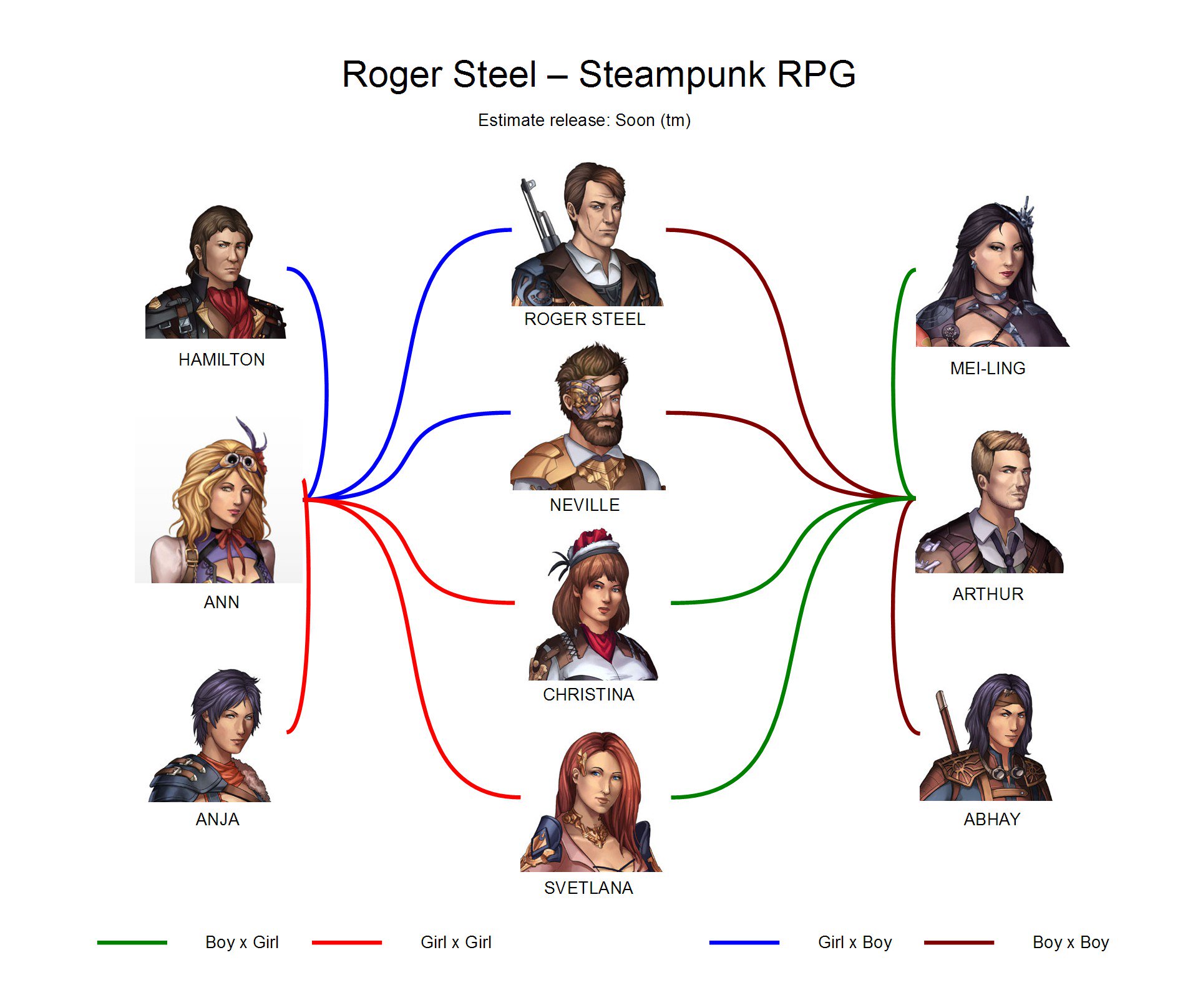

https://pbs.twimg.com/media/DGIgxKgXcAEUSAf.jpg:large" style="max-width:100%">
Lol, spent 30-45 minutes to do this thing! however not a problem, since today heat is so insane that probably I'm not going to code anything

felyarpg
Aug 01, 2017
Overall I like the styles of the characters: Anja is my favourite (pity I'll have to roll a female character to romance her...oh, well!) I think owever there are some possible improvement: I feel Svetlana and Christina eyes are a little small in comparison to Anja and Ann. Expecially Christine feel much older than them.
The guys... Abhay is very cute, so is Neville (that manly beard!) Roger is a little on the older side (he just miss a few white hair and he have the Harrison Ford charme) but Hamilton... well... I really really don't like him. Maybe a goatee would help? I really can't say what is wrong. But I find him stand out as the only "ugly" (in my opinion) character between all of them...
Otherwise, I really like tge style.
jack1974
Aug 01, 2017
Haha tastes are tastes, beside the obvious good-looking Abhay, I think Hamilton (especially in the version wearing his hat) is very cool

OhHaiMe
Aug 01, 2017
I'm liking the look of all the ladies.
jack1974
Aug 01, 2017
One thing is that in the romance CGs, basically ALL the characters looks much better (well also because are naked or semi-naked lol

). I think are amongst the most beautiful CG of all my games
Franka
Aug 01, 2017
Huh, is this the current character art? For some reason I remember it looking better than this...
Oh wait, I shouldn't start that discussion again.

jack1974
Aug 01, 2017
Obviously it follows the formula:
[code]if game_art is not my_super_specific_personal_tastes = art sucks[/code]
I think because scaled down looks worse, I mean you can check the bigger size images in this forum and I don't think they're too bad. For sure better than previous version

jack1974
Aug 01, 2017
Tee is Christina? She should be on purpose not super-attractive, a bit overweight, with a metallic leg, etc. I know Fen wanted to try making different characters. Of course if everyone only wants good looking/perfect people I'll need to adapt, though would be a bit sad
MarSel
Aug 01, 2017
Nah I don't mind Tee (Yes Christina) being a curvier lady. It just looks different to the picture I've seen before No idea how to link it. Was she updated? To be bigger, I mean. I love the metal leg just like Nevelle's Eye patch makes things interesting. Just wondering is all. Maybe it is the smaller eyes.
MarSel
Aug 01, 2017
Ah found it! It's in the 'New Art thread' Page 1 where the picture of Tee is. That's the one I was comparing it too.
jack1974
Aug 01, 2017
Removed that thread since that art will no longer be used.
MarSel
Aug 01, 2017
Ah I see then it makes sense. Will we able able to see the updated versions?
jack1974
Aug 01, 2017
Yes when I have time, however there are already some previews posted at end of "change of artist..." thread.
MarSel
Aug 01, 2017
Of Course no rush. Not like it will be out soon. So just do it when you have the time. Keep up the good work as always.
jack1974
Aug 02, 2017
BTW while doing the chart, I was thinking that something was off... indeed, I found out that I didn't use the updated images with "bigger eyes". So the final art will have bigger eyes (like an image posted in another thread). Somehow the fixes were lost but she'll redo them shortly
Franka
Aug 02, 2017
Ah, so my memory isn't completely busted yet.
jack1974
Aug 03, 2017
Yes, thanks. I admit is quite obvious now that I look at it, but in those days my brain is completely melted by the heat. Just writing emails/blog posts is a big effort

jack1974
Aug 04, 2017

http://i.imgur.com/DNmyjgT.png" style="max-width:100%">
artist updated the images (original on the left, increased eyes on the right). They look better now indeed
